
.webp?width=1921&height=622&name=usecase-banner%20(1).webp)
What is Masking? Definition and Usage
Masking is a graphical process that hides parts of an object or element partially or completely. The result of applying a CSS clipping mask to a graphical item is that the graphical object is painted into the backdrop through the mask, masking off elements fully or partially. When more than one mask layer image is supplied, they are layered similarly to stacked background pictures. Each image is scaled, positioned, and tiled according to the mask attributes. The mask layer photos are placed on top of one another, with the first layer specified on top of the others.
CSS clip, CSS mask image, and mask SVG are often used together for more precise masking, while clip CSS and CSS mask offer additional control over how elements are hidden or displayed.
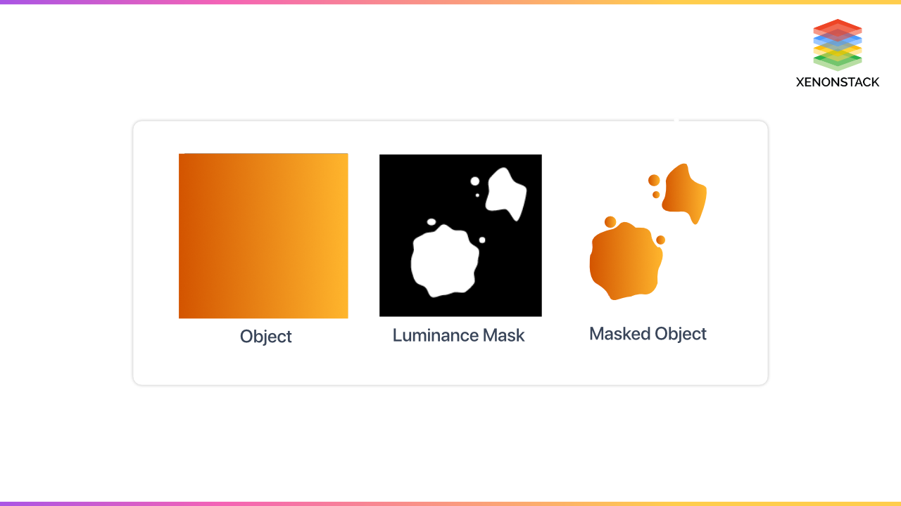 Types of CSS Masks: Luminance vs. Alpha Masks
-
Luminance Masks: This keyword indicates that the brightness value of the mask layer image should be used as the mask value. Nothing in the element is visible when the mask is dark. Everything in the element is visible, and the mask is white. Anywhere in the middle, a piece of the element is visible. The more transparent the mask, the more of the element is seen.
-
Alpha Masks: This keyword indicates that the mask layer image's transparency value (alpha channel) should be used as the mask value. They are similar to luminance masks, except they solely employ the mask's alpha channel. The more opaque the alpha mask, the more the element shows through, which may seem paradoxical.
CSS variables are elements specified by CSS writers with specific values that can be reused across a document. Click to explore about, CSS Custom Properties
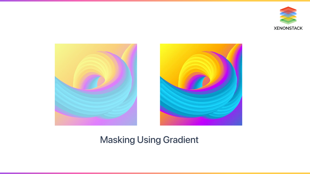
How to do Masking using Gradients?
Let's start with a straightforward linear gradient that runs from transparent to black. The first picture is our default beginning image, and the second image is the mask-image value for our linear gradient:
.mask1 {-webkit-mask-image: linear-gradient(to bottom, transparent 25%, black 75%);mask-image: linear-gradient(to bottom, transparent 25%, black 75%);}
Masking Using Images
As our image mask, we're utilizing a picture that was made with Sketch. The first picture is the image mask, and the second image is the image with the mask applied:
.mask4 {-webkit-mask-image: url("/path/to/image-mask.png");mask-image: url("/path/to/image-mask.png");-webkit-mask-size: 400px 600px;mask-size: 400px 600px;}
Masking Implementation
<style>body {background-image: linear-gradient(#EFDBC8, #D4EBF3);}div {display: flex;margin: 0 auto;-webkit-mask: url(https://assets.codepen.io/423754/cactus.svg) no-repeat 50% 50%/contain;mask: url(https://assets.codepen.io/423754/cactus.svg) no-repeat 50% 50%/contain;min-height: 100vh;position: relative;}div::before {background: url(https://source.unsplash.com/USgb-K0TPxQ) no-repeat 50% 100%/cover;content: "";height: 100%;left: 0;-webkit-mask-image: linear-gradient(transparent 10%, black 80%, black);mask-image: linear-gradient(transparent 10%, black 80%, black);position: absolute;top: 0;width: 100%;}</style><body><div role="image" aria-label="a field of cacti masked in the shape of a cactus fading out toward the top of the masked image"></div></body>
CSS font size adjusts all the measurement units in which font sizes are present, like rem, em, px and viewport units. Click to explore about, CSS Size Adjust for Font Face
What is CSS clip-path()? Shaping Elements with Precision
Clip-path() is a CSS feature that lets you make a clipping zone out of an element. The clipped part's area is visible, while the remainder is concealed. Clip-path() may appear intimidating at first, but it becomes simple to utilize if you grasp the geometry underlying it.Clip-path() is a CSS feature that lets you make a clipping zone out of an element. The clipped part's area is visible, while the remainder is concealed.
The visible zone of visual components is referred to as clipping. Certain SVG graphics components or basic shapes can describe the region. Outside of this area, nothing is rendered. The clip-path property in CSS allows you to specify a specific region of an element to display, with the rest being hidden (or “clipped”) away.
Basic shapes
The clip-path attribute can be set to a variety of different values. In the first case, the value used was circular (). One of the fundamental shape values provided in the CSS Shapes specification is this. This implies you can clip a form and then use the same value for the shape outside to make text wrap around it.
The list of basic shapes is
- circle()
- ellipse()
- inset()
- polygon()
Inset()
The inset() function offsets the clipped region from the element's edge, and it accepts values for the top, right, bottom, and left edges. By utilizing the round keyword, a border radius may be specified to curve the corners of the clipped region.
Circle()
The circle() value, as you can see, generates a circular clipped area. The circle's radius is the first number, which is a length or a percentage. The circle's center can be adjusted using a second optional parameter. In the example below, I'm using keyword values to specify the top right corner of my clipped circle. You might also use percentages or lengths.
Ellipse()
Because an ellipse is a squashed circle, it behaves similarly to a circle() except that it accepts a radius for x and a radius for y, as well as the value for the ellipse's center.
Polygon()
Its value can help you create fairly complex shapes, defining as many points as you need by setting the coordinates of each point.
Clip-path property
- clip-source
- basic-shape
- geometry-box
- none
-
Clip-source: It is a URL that references an SVG <clippath> element.
-
Basic-shape: The piece is clipped to a simple form. Circle, ellipse, polygon, and inset are the four fundamental forms.It's a form whose size and the value of <geometry-box> determine location. If no geometry box has been defined, the border box will be utilized as a reference box.
-
geometry-box: The <geometry-box> defines the reference box for the basic shape. If it is defined with the combination of the <basic-shape>, it will act as the reference box for the clipping done by the <basic-shape>.
Clip-path() implementation
<style>body, html {height: 100%;display: grid;}body {background-image: repeating-radial-gradient(circle at 0 0, transparent 0, #ab4a4a 32px), repeating-linear-gradient(#814542, #814542);background-color: #ab4a4a;}#nonagon {background: rgb(219, 115, 70);width: 500px;height: 500px;clip-path: polygon(50% 0%, 83% 12%, 100% 43%, 94% 78%, 68% 100%, 32% 100%, 6% 78%, 0% 43%, 17% 12%);-ms-clip-path: polygon(50% 0%, 83% 12%, 100% 43%, 94% 78%, 68% 100%, 32% 100% 6% 78%, 0% 43%, 17% 12%);}</style><body><main style="margin: auto"><p id="nonagon"></p></main></body>

Using CSS Clipping and Masking for Creative Effects
CSS clipping and masking provide interesting effects that previously required a graphics editor. Browser support is better than expected but not yet complete. However, most of these effects are unlikely to be essential to your functionality, so consider using clipping or masking here.


