.webp?width=1921&height=622&name=usecase-banner%20(1).webp)
Understanding ValueOps Insights
In today's digital economy, organizations are striving to improve their operations by gaining better visibility and speed. ValueOps Dashboards are essential tools that help teams visualize data and monitor performance, enabling more effective decision-making. In this blog post, we will look into the specific advantages of ValueOps Dashboards, functionalities, and scope for transforming your organization.
ValueOps Insights for Key DevOps Metrics
ValueOps Insights and Dashboards are extensive visual instruments that collect data from various sources and present it in a viewable format. This helps users keep track of performance indicators, key projects, and progress at any given time. Thus, these dashboards help an organization not only in data-related activities but also in developing strategies and converting them into actions.
 Fig 1: Measuring ROI for Business intelligence
Evolution of Dashboards to AI Insights and decision-centric by Generative BI
Dashboards have evolved from their simple Business Intelligence origins towards Generative BI for real-time Insights. They were timetables that showed how certain tangible measurements were performed. Yet, thanks to technological progress and people’s wish to access and use data in real-time and instantaneously change content, current dashboards are the ‘go-anywhere’ database with various tools to visualize the data. This development has been a great advantage for teams needing to pivot quickly as business requirements change.
Key Benefits of ValueOps Insights for DevOps

Fig 2: Advantages of ValueOps Dashboards
1. Enhanced Visibility
With ValueOps Dashboards, stakeholders have direct access to essential metrics. This enhanced visibility enables teams to analyze patterns, see outliers, and act on insights quickly. For instance, sales personnel can evaluate their monthly performance in relation to the target, while marketing personnel can evaluate the success of the campaign as it runs.
2. Improved Decision-Making
Armed with real-time data, an individual making the decision can afford to wait no longer when faced with a challenge or an opportunity. ValueOps Dashboards allow for shorter assessment periods and enhance making the right decisions to achieve better results. For instance, if a dashboard has information with metrics showing a drop in surgery website traffic, it leans towards analyzing its cause rather than waiting for routine team meetings.
3. Streamlined Communication
They serve as the focal point for communication, enhancing interaction among the team members. They coherently present key performance indicators so everyone is updated on how far the project is towards completion and the organisation's overall objectives. This openness helps in teamwork and helps prevent any team member from having any form of miscommunication.
4. Increased Efficiency
Apart from reducing the number of hours spent on activities such as data collection and data visualization, ValueOps Dashboards also reduce the exposure to human errors. This kind of efficiency helps the teams strategize in all areas rather than concentrating on correcting mistakes reported in the manual documentation. Picture a scenario where a project manager is relieved from preparing weekly status update reports, allowing them to focus on solving project-related issues and enhancing team productivity.
5. Better Resource Allocation
ValueOps dashboards help organizations understand which areas are performing poorly and how best to allocate resources. They empower the leadership to read the project's reproductive output and team efficiency data and determine where to direct efforts and budgets. This function allows better allocation of team support where it is most needed, enhancing functionality.
6. Enhanced Accountability
Metrics are visible to every team member, which enhances accountability. People tend to take ownership of work when they see their input helps attain the organization’s goals. That kind of clarity makes individuals in the team want to improve their performance because they will feel proud about the work they have done.
Key Features of ValueOps DevOps Insights and Dashboards
 Fig 3: Important Features of ValueOps Dashboards
Integration of Data and Information in Real Time
ValueOps Dashboards aggregate and retrieve information from many locations, thus guaranteeing that the entire data is current. Such attributes are appreciable to firms that aim to gain competitive insights within the market. Integration ranges from sales figures from customer relationship management software to website metrics or even profit and loss figures, making it possible for departments to create a clear view of their performance.
Dashboards with Adjustable Graphics
Users can add or edit new dashboards to show the appropriate indicators. These may be graphs, charts, or tables, and adjustable visuals assist teams in concentrating on the most important aspects. Customization options help arrange metrics depending on the user’s duties and roles so that all users get the necessary information.
Interactive Elements
Most of the dashboards of ValueOps offer basic functionalities that allow users to drill down to certain levels of detail. The availability of such features not only enhances the experience of each user but also enables them to carry out detailed and thorough investigations. For example, the user is allowed to select any data represented in a form of a graph, allowing them to view additional information that allows them to interpret patterns within the data and use it for informed decision-making.
Alerts and Notifications
ValueOps Dashboards include or can be fitted with alerts that help enhance the user's experience with the dashboard by keeping track and alerting the user of fundamental alterations or abnormal operations in the data. These alerts help teams respond quickly to issues before they escalate or cause more damage. For instance, team members may be notified in case of any schedule slippage throughout the duration of the project, hence enabling pertinent action to be taken immediately.
Collaboration Tools
Multiple dashboards incorporate collaborative features that allow teams to interact and provide insights within the platform. This incorporation integrates various teams, making it easier to interact with the data and, therefore, enhancing the alignment of the teams’ strategies.
Mobile Accessibility
With the current trends of work arrangements, where more people are embracing remote work, mobile accessibility becomes a necessary consideration. Users of ValueOps Dashboards designed for mobile use do not need to worry about when or where to attain critical indices, as the detachable components ensure that even the busiest decision-makers are kept updated.
Adding ValueOps Insights in Your Organization
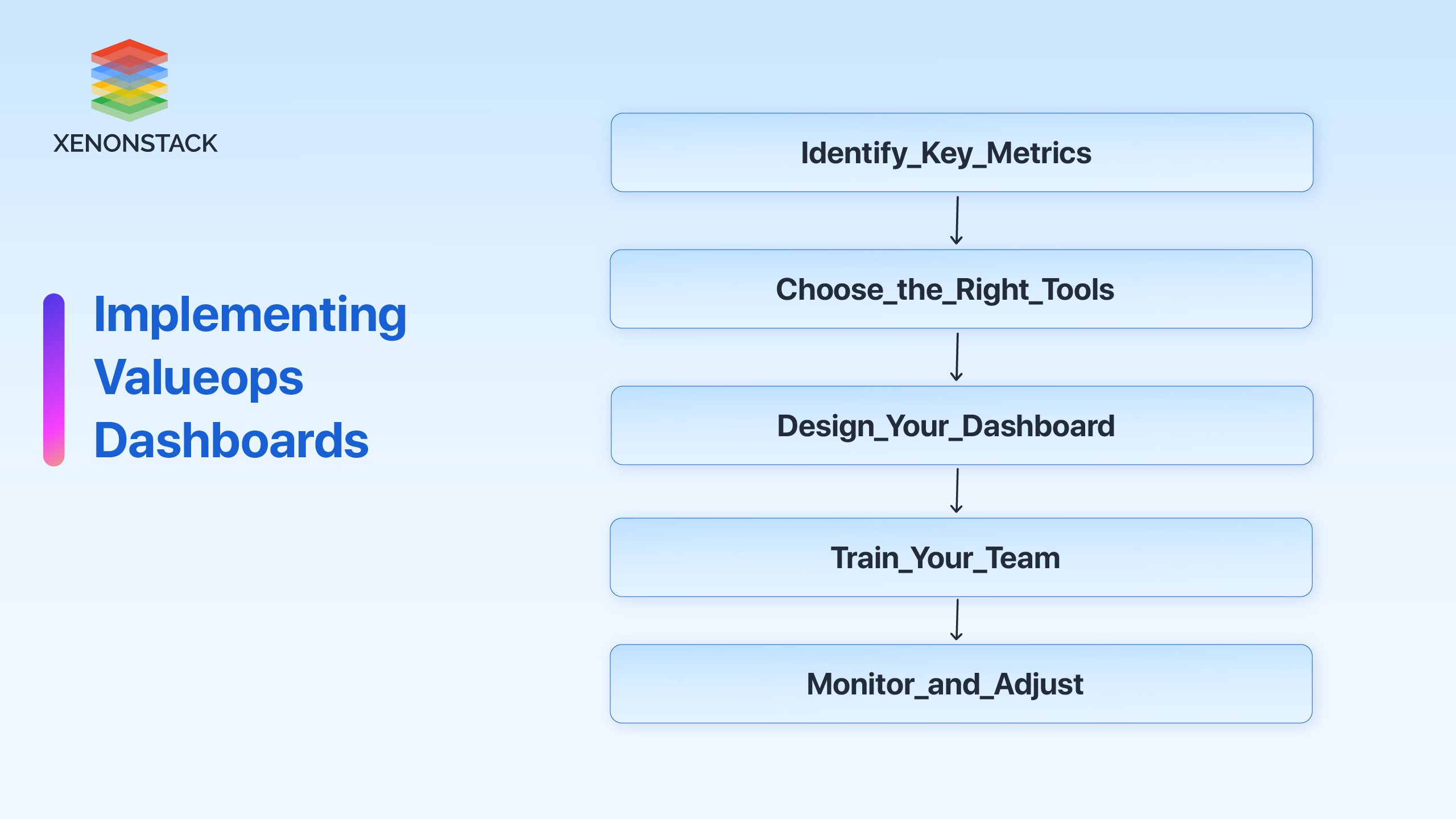
Fig 4: Implementing Valueops Dashboards
Step 1: Identify Key Metrics
Begin with the core metrics that should meet the company's objectives. These must be the key performance indicators that will guide the organisation's policy and strategy. For example, if this company is concerned about customer satisfaction, then there should be a focus on metrics such as the Net Promoter Score (NPS) and customer rating scores.
Step 2: Choose the Right Tools
The next step involves choosing an appropriate dashboard toolbox that fits within the systems and processes already in place. Commonly used solutions are Tableau, Power BI, or any of the existing ValueOps solutions. Before making your choice, think about how user-friendly the board will be, whether it is portable and whether it can incorporate other data sources.
Step 3: Design Your Dashboard
Coordinate with the relevant parties and create an interface that is both functional and easy to read for the relevant content. Make sure that the interface is designed in such a way that the different forms of presentations can be interpreted easily. Working with team members about what information and metrics shall be emphasized on the dashboard so that all the dashboard users are well accommodated.
Step 4: Train Your Team
After the dashboard goes live, provide training to enhance your team’s understanding of its components and purposes. This is vital for optimizing the tools' utility. Don’t stop at providing the resources; also help them use the dashboard appropriately to make the right decisions.
Step 5: Monitor and Adjust
After executing all steps, closely observe how the dashboard performs. Get the users' feedback and revise accordingly. Repeating this cycle helps ensure that the dashboard stays up to date and useful throughout the years.
Best Practices for Using ValueOps
 Fig 5: ValueOps Dashboards best practices
Keep It Simple
It would definitely be appealing to include every metric in the dashboards, but this should be avoided. These are two extremes in the same action. Users can sometimes be overwhelmed by too much information and thereby create doubtful critical insights. Therefore, focus on key metrics that impact the decision-making process.
Regularly Update Data Sources
Make certain that the data sources supplying or contributing data to the dashboard are up to date. Outdated data leads to poor decision-making and ineffective strategies. Get periodic or regular reviews to ensure that water is getting in at the right time.
Promote Data Literacy
Foster the environment of data literacy in the organization. Conduct training sessions and distribute literature so that the team appreciates the need and how to analyze data in the future. If your team is at ease with data, that will enable them to leverage ValueOps Insights and Dashboards better.
Encourage Collaboration
Use the features of ValueOps Dashboards that allow communicating and working together to the fullest. Allow the team members to meet each other and discuss insights and data interpretation as well. This helps to broaden perspectives and visions, resulting in more radical performance measures and innovations.
Continuously Improve
The business environment is continually dynamic, and so are the Three Core Metrics. It will be necessary to modify and change the measures that appear on your dashboards regularly. From time to time, conduct a survey involving users to find out what can be improved.

Case Studies
Case Study 1: A Firm in its Start-Up Stage
A rapidly progressing startup technology company expanded its scope of operation by utilizing ValueOps Dashboards in its project management systems. Looking at key performance indicators relevant to the project time frame and team effort helped the startup improve visibility in different departments.
Outcome:
-
Increase in Projects Completed on Time: The startup accomplished a 30% increase in the number of projects completed on time during the first quarter of the system's adoption.
-
Effective Teamwork Encouraged: The more efficient work of the development and marketing departments shortened the duration of the product's launch.
Case Study 2: A Healthcare Provider
In healthcare, providers implemented ValueOps Dashboards to assess the clinical outcomes for patients and operational effectiveness. The dashboards incorporated indicators of how patients responded to treatment and employee performance in real-time.
Outcomes:
-
Increased patients’ contentment: Systematic usage of timely feedback improved the service provider's scores on patient satisfaction by 25 per cent within six months.
-
Mitigated the Problem of High Employee Turnover: Proper management of staff performance issues enabled the organization to achieve a 15 per cent drop in turnover rates.
Case Study 3: A Supermarket Brand
A supermarket brand employed ValueOps Dashboards to assess stock sales and availability in its different locations. The dashboards drew information from till systems and stock control systems.
Outcomes:
-
Streamlined Stock Control: The chain managed to reduce stockouts by 20 per cent, which greatly improved customer satisfaction.
-
Improved Sales Outcomes: The availability of sales information helped to restructure the marketing plan within the quarter, increasing sales by 15 per cent.
Whats Trending - Real Time Insights with Generative BI
For those who aim to expand in the ecosystem where data is the currency, ValueOps Dashboards are no longer a ‘nice to have’ but a ‘must have’ for organizations. Such dashboards can really alter the way your team works by providing enhanced visibility, enabling better decision making and improving communication.
Equipped with features such as Real-Time Data connectivity, editing, and moulding graphic images or graphs along with other graphical content, ValueOps Dashboards ensure timely and effective decision-making in organizations. Start using ValueOps Dashboards today and leverage the power of your data. Whether you want to improve visibility, resource allocation, or accountability, these dashboards will revolutionize your organization.
- Read more DevOps Managed Platforms
- Discover here End-to-End Managed Machine Learning Platform