What is Kerning in Typography?
Kerning Typography improves the design and the appearance of your written text. It modifies the way to create a better presentation or any appealing visuals. When you are about to finish your design project, create a logo, or finish a website design, it will consider enhancing each node of your design.
Designers rely on kern type adjustments within specialized software to fine-tune spacing for a seamless reading experience. This subtle yet essential process enhances readability and aesthetics, making the text more engaging for the end user.
The process in which Designers create a visual in a computerized software or a device for the Client or End Customer. Click to explore about our, Top 10 User Interface Design Trends
What is Kerning?
Kerning is the method of changing the space between two characters to improve an outwardly satisfying and consistent stream between letters. It is utilized in logos, banners, titles, and different spots where the sporadic separation between the letters is obvious.
It helps make the general text fulfilling to the eye. You may not tell a tremendous exertion by seeing one. In any case, you can perceive a terrible kerning model the second your eyes fall on it. Something will feel off and odd.
When to Use Kerning Typography?
There are several situations where kern type enhances the visual impact of text, including:
-
Headlines: The focal point of a design (whether digital or printed) is usually the headline. What a person sees first upon visiting your website can influence their view of your entire company. You may also play with their emotions regarding your business, such as creating a spooky atmosphere in October or capturing the festive spirit for your seasonal products in the winter. Colors and fonts are significant, but the spacing is vital.
-
Logos: Logos often feature minimal text, so kern type precision is essential. If you adjust the kerning between one pair of letters, you will have to adjust the others, similar to a domino effect – and do not rely on default software settings.
-
Business Cards: Professionals in business are continuously looking for a competitive advantage. Some people will even brag about how good their business cards are compared to others. Looking deeper at the letters utilized allows you to expand on the design aspects of these "small windows of opportunity."Balance, hierarchy, contrast, and alignment are all under your control. The typeface may be inspected even more deeply due to the limited amount of information and messaging on the business cards.
-
Font changes: Font sizes between 10 and 12 are unlikely to benefit from significant changes, but anticipate putting in more effort as your text grows larger. The majority of typefaces are designed for the most common typing sizes. Even if you need to enter a legal disclaimer or a logotype in a font size 7 or 8, the font's default settings will still operate. You may need to make a few adjustments.
Animations on our website may be a robust technique for engaging and entertaining visitors. Click to explore about our, CSS Animation Keyframes and its Advantages
Types of Kerning: Manual, Metric, and Optical
In addition to its phases, we can use it in simple designs. Also, there are different types below:
Metrics Kerning
Uses predefined kern type pairs provided by font designers, automatically adjusting common letter combinations like "To," "Tr," "LA," and "We." This method works best for body text. Most fonts provide these, and some systems automatically employ metrics that default to kern these pairs of letters, so you don't have to spend extra time when you input or import a sentence. Because body copy is often looser, metrics work best.
Optical Kerning
This changes the space between consecutive characters to match the forms of the characters. This is an alternative to the default metrics option in some design applications. It is suitable when a tighter font (like headlines) is required.
Manual Kerning
-
Customizing Kerning for Your Design Needs: It kerns type based on the precise requirements of whatever project you're working on. You can enter the measurements, spacings, and shapes to your specific liking whenever you can't locate the suitable choice within your software.
-
The Downside of Manual Kerning: It will take longer to complete the task because you must enter each detail as if you were starting from scratch. Critical points for it are more subjective; remember these tips from the recommendations as you set off to work on your abilities.
The process of persuading people to engage in specific behaviors through purposeful design strategies. Click to explore about our, Behavioral Design Patterns
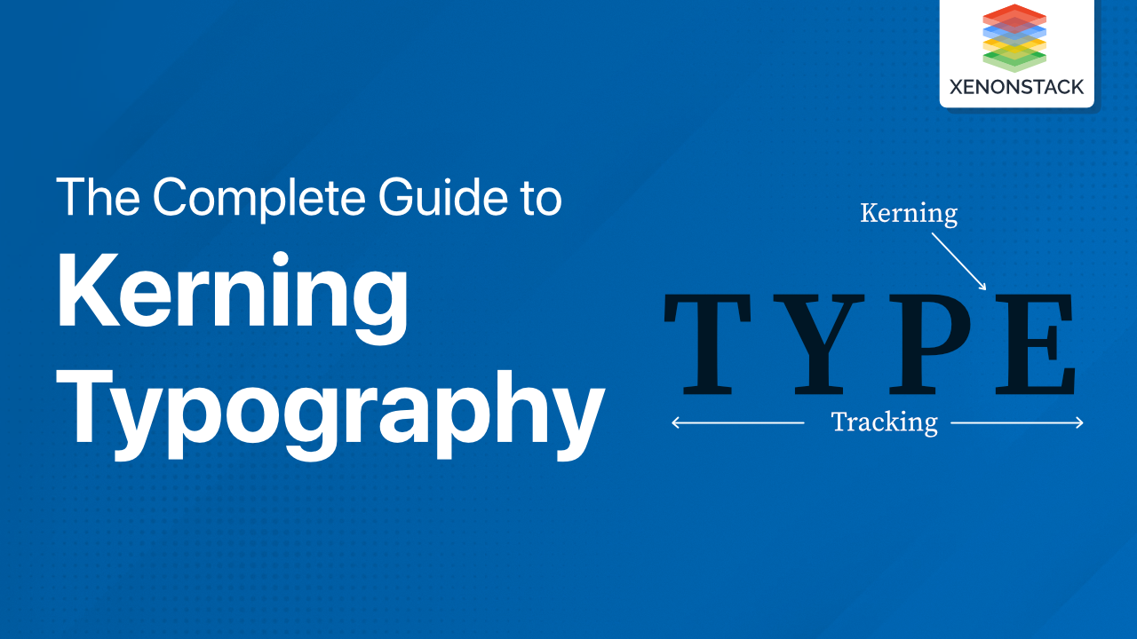
Kerning is Not Tracking
The distinction is straightforward: track refers to the uniform spacing between all letters in a given text selection, and it relates to the spacing between two specific characters.
Watch the Letters
You'll find certain letters more challenging than others once you start it, your headlines, and other critical text regularly.
Let's open Photoshop, change our kerning to "0," and input a few sentences in Times to get a sense of how this works. These findings haven't been tampered with in any way; they're exactly as they are from the software.
All-caps text is notoriously difficult to see, so keep an eye on it as a general rule. When we mix capital and lowercase letters, though, we run into similar issues.
Upside-down Kern
Because your eyes tend to ignore the space in pursuit of reading the word or sentence, it is easy to miss. Adults no longer perceive letters; they see words after decades of reading.
Some designers recommend flipping your type upside down before kerning as an easy way to adjust for this. It's a beautifully basic strategy that allows you to concentrate on the letter shapes and how they fit together rather than the words.
Watch your Word Spacing
Another problematic issue is free fonts. How many of them tend to have awkward spacing between their words?
In general, kerning in free fonts can be awful, but word spacing is a particular issue you should be aware of. When you start working with a font with bad word spacing, it becomes incredibly high maintenance, so use them sparingly or avoid them entirely.
Page speed can play an important factor affecting the conversion rates for big enterprise online businesses. Click to explore about our, Website Page Speed Optimization Techniques
Enhancing Typography Through Kerning
Kerning typography is a method that relies on your practice; you can also improve it by observing other designers. Although you might find the wrong typography somewhere, it improves your vision of typography skills.