Effective data visualization is crucial in big data analytics, transforming vast and complex datasets into understandable graphical representations. With the right tools, organizations can detect trends, uncover insights, and make data-driven decisions efficiently. Poor visualization, on the other hand, can lead to misinterpretations, resulting in costly business consequences.
Platforms like Facebook handle approximately 4 petabytes of data daily, including videos, images, and text. Without advanced visualization techniques, deriving insights from such massive datasets would be nearly impossible.
How Organizations Leverage Big Data Visualization
-
Facebook utilizes "HiPlot" to explore and visualize multidimensional data interactively.
-
For comprehensive data analysis, IBM integrates "Big SQL" with visualization tools such as Zeppelin notebooks, Tableau, and Cognos.
-
Amazon employs tools like AMZ Base, Amylase, and SellerApp to facilitate data visualization and analytics.
-
Microsoft Power BI enables organizations to create interactive dashboards, integrate AI-driven insights, and perform real-time big data analytics.
Organizations can use these tools to convert raw, unstructured data into meaningful visual narratives, empowering decision-makers with clear, actionable insights.
Importance of Data Visualization Dashboards
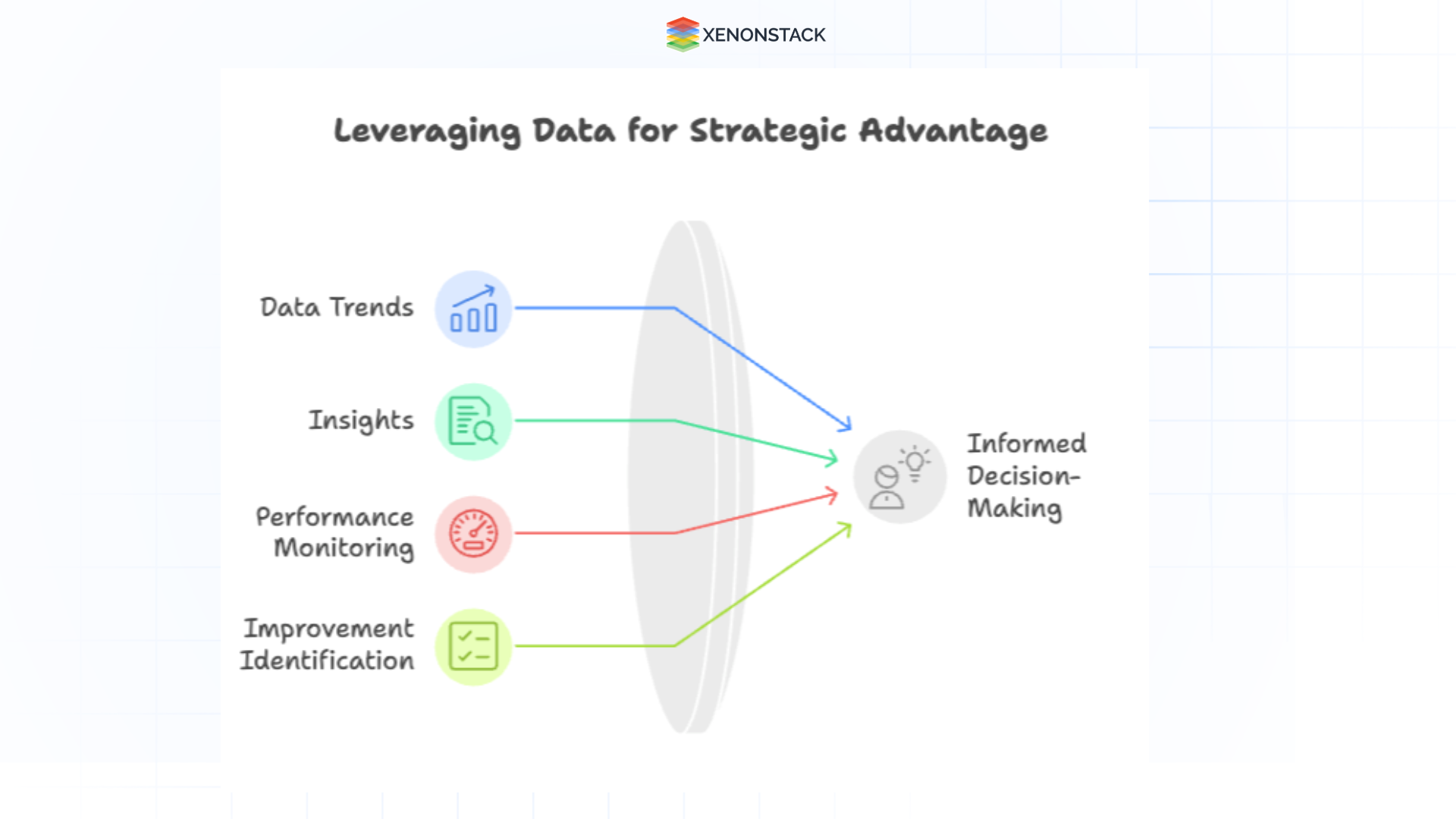 Fig 1: Importance of Data Visualization Dashboards
Organizations generate and store massive amounts of information every day. However, raw data can be challenging to interpret, mainly when spread across various systems or presented in dense formats. Data visualization dashboards help bridge this gap by transforming complex data into clear, visual formats that are easier to understand and act upon.
1. Makes Complex Data Understandable
Dashboards convert detailed datasets into visual elements like charts, graphs, and maps. This simplifies interpretation, allowing people at all levels of an organization to grasp key insights quickly.
2. Enables Real-Time Tracking
With dashboards, key metrics and performance indicators can be monitored in real-time. This allows for faster response to challenges and more timely decision-making, helping organizations stay agile.
3. Supports Better Decisions
When data is presented visually, patterns and relationships become more apparent. This clarity leads to more informed and confident decisions across departments.
4. Saves Time and Improves Efficiency
Instead of combing through multiple spreadsheets or reports, users can access a centralized view of essential data. Dashboards streamline the process, reduce errors, and save valuable time.
5. Interactive and Customizable
Dashboards can be tailored to show the most relevant information for specific roles or goals. Many platforms allow users to filter data, drill down into particular areas, and change views to suit their needs.
6. Encourages Collaboration
By offering a single, consistent view of essential data, dashboards help teams work together more effectively. Everyone operates from the same information, which promotes alignment and transparency.
7. Reveals Trends and Forecasts
Visual dashboards make detecting trends, spotting irregularities, and anticipating future outcomes easier. This proactive approach helps teams prepare, adapt, and plan more confidently.
8. Engages Users
Well-designed dashboards are visually appealing and easier to interact with than traditional reports. This increases user engagement and encourages a more frequent review of key metrics.
Challenges in Big Data Visualization
Despite advancements in visualization tools, challenges persist when dealing with large-scale datasets:
-
Perceptual Scalability: Human cognitive limitations make it challenging to interpret vast datasets, and screen size constraints further complicate effective visualization.
-
Real-time Scalability: Processing and rendering massive datasets in real-time require substantial computational resources.
-
Interactive Scalability: As datasets grow, visualization tools may face performance bottlenecks, resulting in lagging interfaces and system slowdowns.

Agentic AI: The Future of Enterprise Data Visualization
Agentic AI transforms big data visualization by automating insights, detecting patterns, and enhancing real-time decision-making. Unlike traditional AI, Agentic AI autonomously analyzes and visualizes data, reducing the burden on business leaders and analysts.
Key AI Capabilities for Data Visualization
-
Automated Data Interpretation: AI detects anomalies and highlights critical insights without manual intervention.
-
Predictive Analytics: Machine learning algorithms forecast trends and simulate business scenarios.
-
Natural Language Processing (NLP): Enables executives to ask business questions and receive AI-generated visual reports instantly.
-
Data Imputation & Augmentation: AI fills missing data gaps and enriches datasets for more accurate business intelligence.

Big Data is all about large and complex data sets, which can be structured and unstructured. Its concept encompasses the infrastructures, technologies, and tools created to manage this large amount of information.
Data Visualization with Microsoft Power BI
Introduction to Power BI
Microsoft Power BI is one of the most widely used business intelligence (BI) tools, allowing users to visualize data interactively and in real time. It helps organizations:
-
Create dynamic dashboards for tracking key performance indicators (KPIs).
-
Integrate with multiple data sources, including SQL Server, Excel, and cloud platforms.
-
Leverage AI-driven insights using DAX (Data Analysis Expressions) and natural language processing (NLP).
-
Enhance collaboration with interactive reports and real-time data exploration.
Installation and Setup of Power BI
Power BI is available in different formats:
1. Online Version: This can be accessed via the Microsoft Store or Power BI Web Service.
Fig 2: Power BI
2. Desktop Version: Available for Windows machines (Mac users can use Windows Azure to run it).
To install:
 Fig 3: Power BI Desktop
-
Download the latest version (32-bit or 64-bit).
-
Follow the installation prompts to set up Power BI Desktop.
-
Sign in with a Microsoft account to access online features.
Key Features of Power BI for Big Data Visualization
-
Diverse Visualization Options: Includes bar charts, pie charts, treemaps, filled maps, funnel charts, and waterfall charts.
-
Data Connectivity: It imports data from sources such as SQL Server, Excel, Azure, APIs, and third-party applications.
-
Interactive Dashboards: Allows users to create visually appealing reports with real-time filtering and drill-down options.
-
Q&A Functionality: This enables users to ask questions in natural language, and Power BI automatically generates visual insights.
-
AI-Powered Analytics: Uses machine learning models to predict trends and generate meaningful insights.
-
Data Relationship Mapping: Helps users understand data dependencies and relationships between multiple datasets.
-
Regular Updates: Power BI receives monthly updates with new features and optimizations.
Data Analytics Connectivity in Power BI
Power BI allows seamless connectivity with various data sources, such as:
-
Excel: Imports and transforms spreadsheets into dynamic reports.

Fig 4: Excel With Power BI
-
SQL Server: Connects directly to enterprise databases for robust data analysis.
 Fig 5: SQL with Power BI
-
Cloud Data Warehouses: Supports integrations with Azure, AWS, Google Cloud, and Snowflake.
To connect a dataset:
Click on "Get Data" and choose a source (Excel, SQL Server, APIs, etc.).
Load the dataset and preview the available tables.
Establish relationships between datasets for enhanced analytics.
Agentic AI-Enhanced Big Data Visualization Tools
Several AI-powered visualization tools are shaping big data analytics:
![]()
Fig 6: Types of Visualization
-
Google Charts: A versatile tool that supports structured and unstructured data, allowing users to create a variety of customizable visualizations for web and mobile applications.
-
Tableau is an intuitive platform that leverages AI-driven analytics to detect patterns automatically, providing valuable insights and facilitating interactive data exploration.
-
Microsoft Power BI: Combines AI-powered predictive analytics with natural language processing (NLP), enabling users to generate visual insights and ask data-driven questions in plain language.
-
D3.js: A powerful open-source JavaScript library used to create dynamic, interactive, and highly customizable data visualizations for web-based applications.
-
Datawrapper: A user-friendly tool designed for creating responsive, high-quality charts and maps that can be easily embedded into websites and reports.
-
Databox: A real-time, AI-enhanced dashboard that aggregates data from various sources, helping businesses monitor key performance indicators (KPIs) and make informed decisions instantly.
Designing an Interactive Dashboard in Power BI
A dashboard in Power BI is a single-page visualization that combines multiple data insights into a unified view. Key steps in creating an effective dashboard include:
-
Selecting the Right Metrics: Choose KPIs relevant to business objectives.
-
Choosing the Right Visualization: Use line charts for trends, bar charts for comparisons, and pie charts for proportions.
-
Building Interactivity: Enable drill-downs, slicers, and filters for user engagement.
-
Ensuring Data Accuracy: Validate sources and ensure consistency across datasets.
Example Dashboards in Power BI
-
Employee Productivity Dashboard: Uses line charts to track productivity trends.
-
Financial Performance Dashboard: Employs treemaps to visualize revenue and expenses.
-
Project Time Allocation Dashboard: Displays time spent on different projects using clustered bar charts.
Best Practices for Big Data Visualization
Leverage NoSQL for Unstructured Data: Store raw data in MongoDB before refining and visualizing it.
Choose the Right Visualization Tools: Select AI-powered tools based on dataset complexity.
Incorporate AI and Machine Learning: Enhance predictive analytics using AI-driven models.
Develop User-Friendly Dashboards: Ensure dashboards are interactive, intuitive, and visually appealing.
The Future of Data Visualization with Agentic AI
The evolution of data visualization is moving toward AI-driven intelligence, enabling businesses to automate insights, improve predictive analytics, and optimize decision-making. As AI technology advances, Agentic AI will continue to revolutionize big data visualization by:
-
Enhancing real-time analytics.
-
Automating complex data transformations.
-
Personalizing insights through intelligent agents.
With the integration of Power BI, Tableau, and AI-driven analytics, businesses can unlock the full potential of their data resources, leading to smarter, faster, and more impactful decision-making.

More Ways to Explore Us
Data Quality Management and its Best Practices.
Top 10 Best Practices for effective Data Visualization
Advanced Data Visualization Techniques and its Features